Brutalism: Brusque, Ugly And Totally Functional

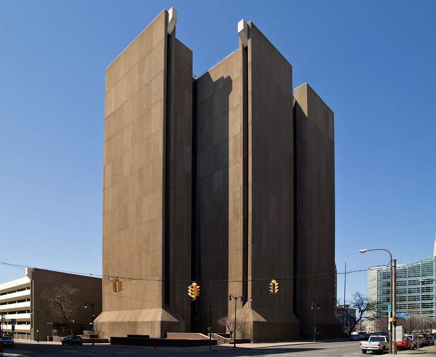
Brutalism Buffalo

In terms of style, brutalism is to architecture what Hemingway is to literature. Taking an axe to Haussmann-style architectural flourishes in favor of honest functionality, brutalism represents a certain frankness and seriousness within 20th century architecture.

The movement hit its peak in popularity from the 1950s to the 1970s, with brutalism’s strong, fortress-like elements being employed in many governmental projects and commercial centers around the world. Built in 1974, New York’s Buffalo City Court Building (featured above) is one such example.

The style did not come without its critics, especially by those well-accustomed to spaces loyal to more classical aesthetics. Prince Charles is one of them. Charles has referred to brutalist-influenced buildings as “piles of concrete” and in 1987 went so far as to say that “You have to give this much credit to the Luftwaffe (Germany’s air force during World War II): when it knocked down our buildings, it didn’t replace them with anything more offensive than rubble.”

The post Brutalism: Brusque, Ugly And Totally Functional appeared first on All That Is Interesting.

Façadism: Proof That Compromise Does (Or Doesn’t) Work

Facadism Valparaiso Chile

Fusing together modern and classical styles, this building in Valparaiso, Chile serves as an apt example of “façadism,” or the practice where a building’s façade is designed or constructed separately from the rest of the building.

Pending your tastes, façadism exemplifies the rewards of compromise (an existing space can be developed without sacrificing its historical elements) or proof that compromise doesn’t work (façadism tries to bring together two distinctive styles into one building and thus produces little more than visual confusion). In any case, the CSAV headquarters–featured above–in Valparaiso’s Sotomayor Plaza is sure to generate strong opinions.

For more interesting architecture, be sure to check out our gallery of tiny homes and modern architecture in Tehran!

The post Façadism: Proof That Compromise Does (Or Doesn’t) Work appeared first on All That Is Interesting.

These Whimsical Flying Houses Speak To Your Inner Child

Paris Flying Houses

Flying Houses Laurent Chehere

Source: Gag Daily

Parisian architecture and a fantastical fairytale world collide in Laurent Chehere’s collection of flying homes. The whimsical series plucks ordinary suburban residences–eroding hotels, circus tents, trailers, and graffiti-covered structures–from their urban settings and places them in midair.

Laurent Chehere Photography

Source: Studio Ang

Mobile Home Flying

Source: Zeynep

French photographer Laurent Chehere creates each of the flying houses using a mixture of photographs and digital manipulations, composed on a large scale so as to capture the most minute details. By removing the buildings from their urban context, he creates stories both real and imagined, infused with details and references to old Paris and the movies. Each image becomes a mystery, with clues to its inspiration often hidden in plain sight.

Circus Flying Houses

Source: The Guardian

Paris Architecture Elevated

Source: Telegraph

No Concession Laurent Chehere

Source: Huffington Post

The post These Whimsical Flying Houses Speak To Your Inner Child appeared first on All That Is Interesting.

The Weird And Wonderful Houses Of Pablo Neruda

Neruda Homes Isla Beach

Neruda Homes Chascona Eyes

A row of eyes watches over La Chascona, a house designed for an affair. Source: Flickr

The Chilean poet Pablo Neruda was infatuated with being unusual. He would only use green pens to draft his poems, and he even gave himself his own name. His parents had chosen to call him Ricardo Eliezer Neftali Reyes y Basoalto, but Ricardo Reyes re-christened himself as Pablo Neruda as a teenager.

In his Nobel Prize acceptance speech, Neruda said, “I did not learn from books any recipe for writing a poem.” The same holds true for designing his homes. Full of strange collections of shells, beetles, colored glass, and mementos of life on the sea, Neruda’s three spectacular houses – Isla Negra, La Sebastiana, and La Chascona – are profoundly odd. They are as original as his silky verse.

Isla Negra

Neruda Houses Arches Isla

Archways leading around the back of Isla Negra and offering a glimpse of Neruda’s collection of colored glass. Source: Flickr

The author of Twenty Love Poems and a Song of Despair, The Book of Questions, The Captain’s Verses, and dozens of other books spent his twenties as a diplomat. His posts included Burma, Sri Lanka, Singapore, and Spain. When he returned to Chile at the age of thirty-three, he wanted a home where he could write. He found it on the Pacific coast, south of Valparaiso in central Chile.

Neruda Homes Isla Negra

Isla Negra, Neruda’s beloved home on the Chilean coast. Source: Flickr

Neruda called his coastal chateau Isla Negra. It isn’t on an island, and the house is painted blue, but Neruda gave the place this name because of its black rocks and because, for him, it was an isle of isolated calm. He lived there, off and on, from 1937 until his death in 1973.

Neruda Street Sign

This street sign leads to Isla Negra. Source: Flickr

Set on a sandy knoll on the edge of the ocean, Isla Negra reflects Neruda’s devotion to the deep. The house itself is designed as ship, with narrow passageways and wood-plank floors. Sails, tusks, ships-in-bottles, shells, and artifacts from the poet’s world travels brim from the shelves and nooks of each room. Neruda collected ship figureheads, and these carved wooden women, mermaids, and sirens appear throughout the sprawling home. When he entertained guests, he would call himself the “Captain” and sometimes even dressed in costume.

Cut Out Figures

All of Neruda’s homes had weird cutouts like these at Isla Negra. Source: Flickr

Neruda also kept a private bar at Isla Negra. Decorated with the same nautical knickknacks as the rest of the house, the bar has another distinguishing feature. When a friend died, Neruda would carve his name into the support beams above the bar. Visitors to the house today can see seventeen names scratched into the wood.

Neruda Homes Captains Bar

Neruda’s “captain’s bar” at Isla Negra. Source: Wikimedia Commons

The post The Weird And Wonderful Houses Of Pablo Neruda appeared first on All That Is Interesting.
Your Dream Home Is Actually In Lima, Peru

S House Lima Peru

Source: Arch Daily

Architectural firm Domenack Arquitectos have played with space and enclosures to generate the perfect, open home for Peruvian climates. From the architects:

The house is the result of dealing with three important variables: satisfying the functional needs of the family, adapting the design to a difficult sloping topography without resorting to complicate and expensive structures, and capturing the views towards a golf course despite the fact that the plot is not adjacent to it.

The design of the house is planned over an existing natural platform located 3m above street level. This decision allowed locating only the parking and service areas at street level, while the rest of the program is located above the natural platform.

The house is developed in 3 levels, following the rocky ascending topography of the plot. The functional and spatial distribution derives from the customs and needs of the clients…[meaning that] the main garden, pool and social areas are located in the first level, while the private areas are located in the second and third levels.”

The post Your Dream Home Is Actually In Lima, Peru appeared first on All That Is Interesting.

What We Love This Week, Volume CXXII

Migrant Crisis Departing Boat

Migrant Crisis Departing Boat

A man watches a ferry depart from Patras, Greece. Afghan, Iranian and Sudanese migrants, many living in abandoned factories in Patras, try to stow away on nearby ferries to Italy. Source: The Atlantic

The Mediterranean Migrant Crisis

Migrant Crisis Rescue Boat

Migrants crowd an inflatable dinghy as an Italian rescue vessel approaches off the Libyan coast. Source: The Atlantic

Fleeing the war-ravaged countries of Africa, the Middle East and Asia, trekking overland to Turkey or Libya, then crowding into ramshackle dinghies in hopes of crossing the Mediterranean into Europe. This is the multipartite journey behind the increasingly dire Mediterranean Migrant Crisis. 60,000 people have made the journey this year alone, according to the UN–and 1,800 of them did not survive. But even for those who do, the journey doesn’t end there. From those who must then hide out in Greece’s abandoned factories to those who attempt to stow away on trucks and ferries bound for Italy and beyond, see more at The Atlantic.

Migrant Crisis Dead Body

The body of a dead migrant is carried from a merchant ship in the Sicilian harbor of Catania on May 5. Around forty migrants died in the Mediterranean the day before, according to the survivors. Source: The Atlantic

These Are Beauty Treatments. No, Really.

Bizarre Beauty Freckle Removal

Procedure of removing freckles with carbon dioxide, 1930s. Source: Vintage Everyday

Although they may look like stills from a German expressionist horror film or police photos from an asylum that was shut down because of horrific patient abuse, these photos, in fact, reveal actual beauty treatments used in Europe and the United States in the ’20s, ’30s and ’40s. While fruit masks and ice masks are still used today, they certainly don’t look like they did then. Let’s hope that Max Factor, whose procedures are among those pictured here, doesn’t bring back any of these disturbing contraptions. See more–if you dare–at Vintage Everyday.

Bizarre Beauty Warming Mask

Warming mask for the face and head skin, 1940. Source: Vintage Everyday

Bizarre Beauty Hair Treatment

Permanent hair procedure. Germany, 1929. Source: Vintage Everyday

Tuscany’s Stunning Sheep-Grazing Fields: Where Desktop Wallpapers Are (Probably) Born

Sheep Tuscany Grass Sunlight

Source: Bored Panda

Bathed in warm, golden rays, free to roam the soothing slopes of lush, sun-dappled fields, these sheep live better than we do. But until the cost of actually traveling to Tuscany, perhaps Italy’s most picturesque region, goes down, you may have to settle for the lovely landscape photography of Marcin Sobas. His eye for color and light makes for photography as rich as oil on canvas. Explore more of Sobas’ Tuscany at Bored Panda, then join him in the luminous lakes and majestic mountains of Europe.

Sheep Tuscany Sun Rays

Source: Bored Panda

Summer Pasture Tuscany Sheep

Source: Bored Panda

The post What We Love This Week, Volume CXXII appeared first on All That Is Interesting.

Six Modern Buildings You Won’t Believe Are In Tehran

Tehran Architecture Cityscape

Tehran Architecture Cityscape

Tehran at dusk Source: Flickr

While Iran has seen waves of great political reform–and to some, regression–over the past several decades, both the monarchy and the current republic have used architecture to shape and reflect Iranian identity, especially in its capital city, Tehran. Iranian architecture has a continuous history dating back to 5000 BC and is marked by its cosmic symbolism, inventiveness and geometric balance. During the Pahlavi dynasty, much of the architecture imitated European styles at the risk of losing specifically Persian identity. Since the revolution, architects have migrated toward modern designs fused with Iranian inspiration, particularly in the capital.

The same attention to detail that brought Persepolis to life can still be seen in contemporary Tehran architecture. And while some people may perceive Iran as a country clinging to anachronisms, these six buildings beg to differ. They embrace nature, bring in light and are changing the façade of the largest city in Western Asia:

The Barin Ski Resort

Barin Ski Resort

Source: Archello

Many forget that the Alborz mountains make Iran a prime ski destination, and one that caters to a pretty high-profile clientele. Located just outside of Tehran is the Barin Ski Resort, whose form was inspired by igloos.

Click here to view slideshow

The post Six Modern Buildings You Won’t Believe Are In Tehran appeared first on All That Is Interesting.

7 Spectacular Tiny Homes That Prove Size Doesn’t Matter

Hut on Sleds New Zealand

7 Amazing Tiny Homes

Source: Daily Mail

Tiny homes are sprouting up all over the world, in both highly urbanized cities and some of the earth’s most remote locales. For some people, the benefits are endless: tiny homes are eco-friendly, cost-effective, and perfect for those who want to start living out and about in the world. Yet for the rest of us, tiny home living sounds adventurous–if not impossible–like we’ve swallowed one too many of Alice’s pills in Wonderland.

Yet for people who are looking to cut costs, today’s tiny homes boast not only a small up-front purchase price, but also cost a lot less to keep going. One tiny home costs just a few thousand dollars to build, and mere dollars to maintain.

Plus, eco-friendly designers and high-end architects are dreaming up new ways to configure these tiny houses to maximize liveability and usability, so, for the most part, residents no longer have to give up their creature comforts. Just let these 7 incredible abodes do the talking:

The Hut On Sleds

Despite measuring in at 430 square feet, the Hut on Sleds was designed with function, safety, comfort and local regulations in mind. The two-story, steel-framed home can close up when weather conditions on the New Zealand shoreline get rough or be moved using the structure’s two wooden “sleds” should the country’s coastal erosion zone creep too close for comfort.

Ladders carry residents to bed or to the roof, with each level offering a picturesque view of the far-off Mercury Islands. The Hut on Sleds was designed by Crosson Clarke Carnachan Architects and was featured in Vogue:

Click here to view slideshow

The post 7 Spectacular Tiny Homes That Prove Size Doesn’t Matter appeared first on All That Is Interesting.

Frank Lloyd Wright Practiced Sustainable Design Before The Movement

Falling Water House

Suburbs

Source: Kyle Anderson

In the United States, many conceive of the 20th century as a time when man successfully separated humanity from nature. One of the most obvious examples of this can be found in popular visions of modern architecture. After the war, the American economy thrived and 1950s and 60s suburban development quickly churned out homes to meet nationally increasing demand. And thus the suburbs as we think of them today were born. American city growth continued to expand outside of city centers and by the 1980s, suburbia was not just a growing reality but an ideal destination for many.

But some were uncomfortable with the cost of suburban sprawl. It seemed that homes grew bigger at the risk of habitat destruction and energy waste. Born out of the 1970s environmental movement, contemporary architects have injected the concept of sustainability into their designs, seeking not to use the home to separate people from nature but as a device to re-integrate the two. For these designers, new home plans are focused on native material usage, energy efficiency, recycling and blending nature with human construction. But this isn’t completely a new concept; it’s a rediscovery of earlier principles.

Frank Lloyd Wright Face

Frank Lloyd Wright Source: NBC News

Over 100 years ago, innovative architect and designer Frank Lloyd Wright was guided by these very conventions. Wright was born in Wisconsin in 1867, and briefly studied civil engineering at the University of Wisconsin. He worked as a draftsman before opening his own architectural firm in 1893, where he completely changed the concept of home design.

Wright introduced the word “organic” to describe his architectural philosophy in 1908, which far preceded the farm to table movement. Wright focused on harmony of parts in relation to the whole, and believed that a home shouldn’t overcome its surrounding landscape like the Addams Family mansion. Rather, it should blend with the environment in an act of architectural transcendentalism. Landscaping was crucial to his designs, as were windows and outdoor spaces that convened nature and living areas.

Falling Water House

Wright’s historic Fallingwater house Source: Wright House

Long before Al Gore was making movies, Wright championed his concerns about energy consumption in his designs. His Usonian houses were small and single-storied, focusing on liveability in minimum space, and giving owners unique designs at moderate cost. Wright built his homes to provide for multiple heating and cooling options. Sometimes he would create open spaces around a central hearth; at other times, he would design passive solar heating elements and windows that provided cross breezes. These cost-effective features remain a significant part of sustainability architecture today.

Fallingwater is Frank Lloyd Wright’s most popular and recognizable home, but there are many others that embrace his vision of organic architecture and convey his love of nature. As Wright said, “The architect must be a prophet – a prophet in the true sense of the term – if he can’t see at least ten years ahead, don’t call him an architect.” Obviously a visionary, these three houses signify Wright’s philosophy and convey the history of a sustainability movement that began almost a century ago.

Click here to view slideshow

The post Frank Lloyd Wright Practiced Sustainable Design Before The Movement appeared first on All That Is Interesting.

21 Stunning Photos Of Abandoned Bulgarian Towns

abandoned bulgaria inner dome

abandoned bulgaria no entry

This former dairy farm looks to have been pulled directly out of a scene from a post-apocalyptic film. The ominous sign on the gate reads “No Entry!”
Source: Bored Panda

As the Soviet Union began to collapse in 1989, Bulgaria entered a new, challenging phase of its development. While the Bulgarian state eventually abandoned communist ideologies for more market-oriented practices, their memory remains in the form of abandoned infrastructure.

These spectral structures stoke the imagination of many, one such person being Bulgarian photographer Hristo Uzunov. From his home base in the Bulgarian capital of Sofia, Uzunov has spent two years drawing out what he calls “The Abandoned Bulgaria” through photos, traveling to more than twenty of these deserted locations to capture their existence, perhaps to remind the nation of its past as knowledge of it recedes from memory.

Click here to view slideshow

If you enjoyed these beautiful abandoned photographs, check out our posts on abandoned Detroit and the most popular All That Is Interesting pictures!

The post 21 Stunning Photos Of Abandoned Bulgarian Towns appeared first on All That Is Interesting.